Honourable Mention-Musica, bringing people together with music.
PROJECT
Listening to music has been a huge part of my life, from listening live at concerts to CDs, the radio, and now on the phone. It has been an individual activity and a shared experience with my friends. For this Adobe Challenge, the prompt was, “How can we bring back that social music experience that was once experienced in-person in this increasingly digital world?” Tasked to design an accessible third-party mobile app where people can easily discover and share their love of music with others in the same space, in person, within one week, we did user research, ideation, and prototyping to create our app Musica 🎵. Through creating music rooms, people can easily bring their friends and family together to create a platform-agnostic playlist to enjoy. To foster a sense of music sharing community, public rooms allow people to discover new music and friends at the same time.
With 345 participants from 113 universities across the US, UK, and Canada, we are very excited to have won the honourable mention. 🎉 🎉 This has been a great learning opportunity and we are very proud of the progress that we have made from the first creative jam within 2 months. It was amazing to see how much my teammate and I can accomplish within a limited time frame through team collaboration and hard work.
INFO
Team
Serena Tran (Me), Yuwei Jiang
My Contributions
UX Research, Wireframing, Hi-Fidelity Screen Designs, & Prototyping
Timeline
February 24th-March 4th, 2022
Tool
Adobe XD
Deliverable
Interactive high-fidelity prototype
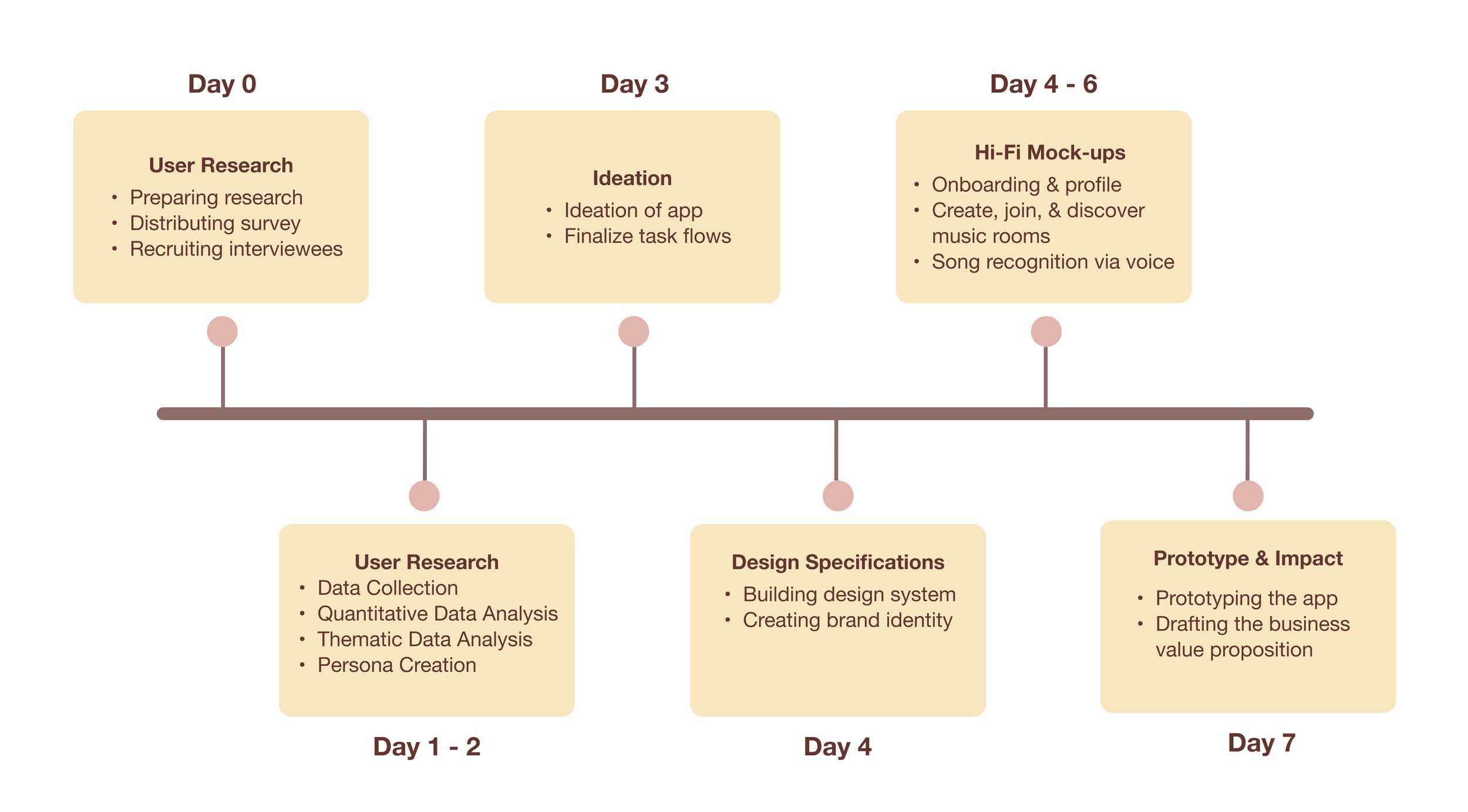
Product Roadmap - Organizing
We first had a kickoff meeting to create a product roadmap of how to bring our app to life within one week. We discussed what our goals were, the tasks, and roles and responsibilities were to execute this project. We both agreed that we first wanted to do user research to better understand the problem space and who our target user groups were. This would allow us to later design intuitive experiences backed by user-driven data.
User Research - Listening & Empathizing
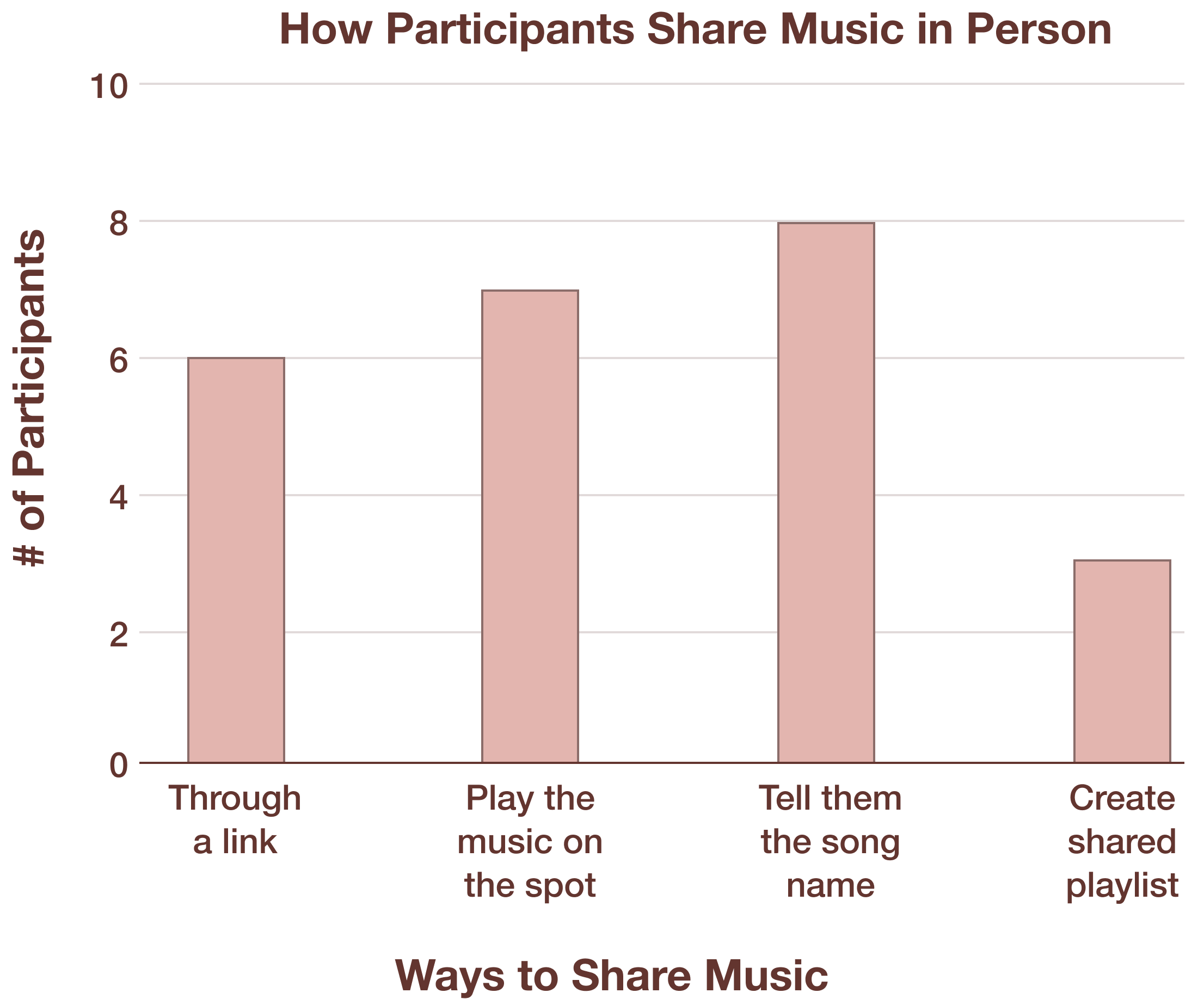
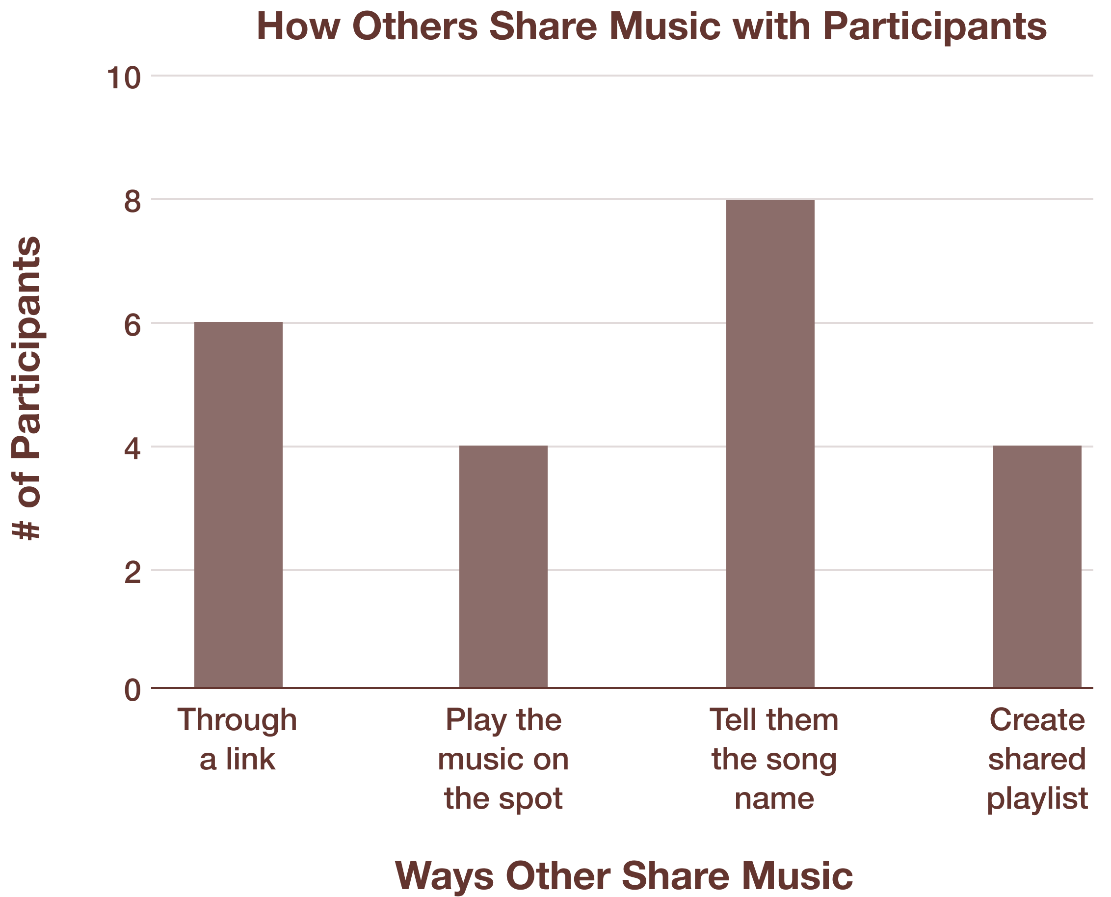
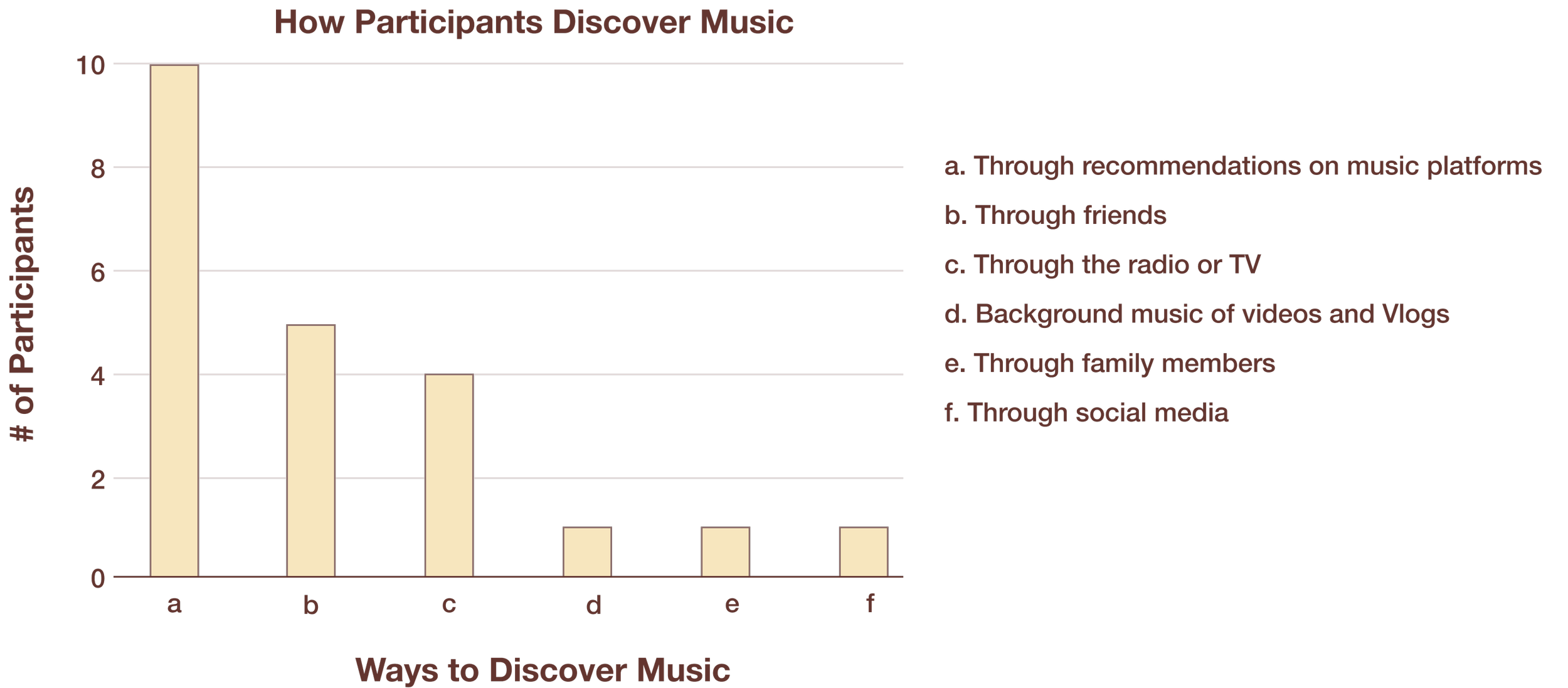
To better understand the problem space and determine our potential users groups, we conducted user research first, collecting data via surveys (Link) from 16 users and running semi-structured interviews with 4 of those 16 users (Link). The selection criteria included users who currently shared and discovered music in person. Doing user research was crucial as we were not the users and we recognized that no matter how beautiful our app may be designed, if it doesn’t meet the user’s needs, then it is not functional. It should be noted that only a small sample size was collected due to time constraints. Some key quantitative survey findings that we found were:

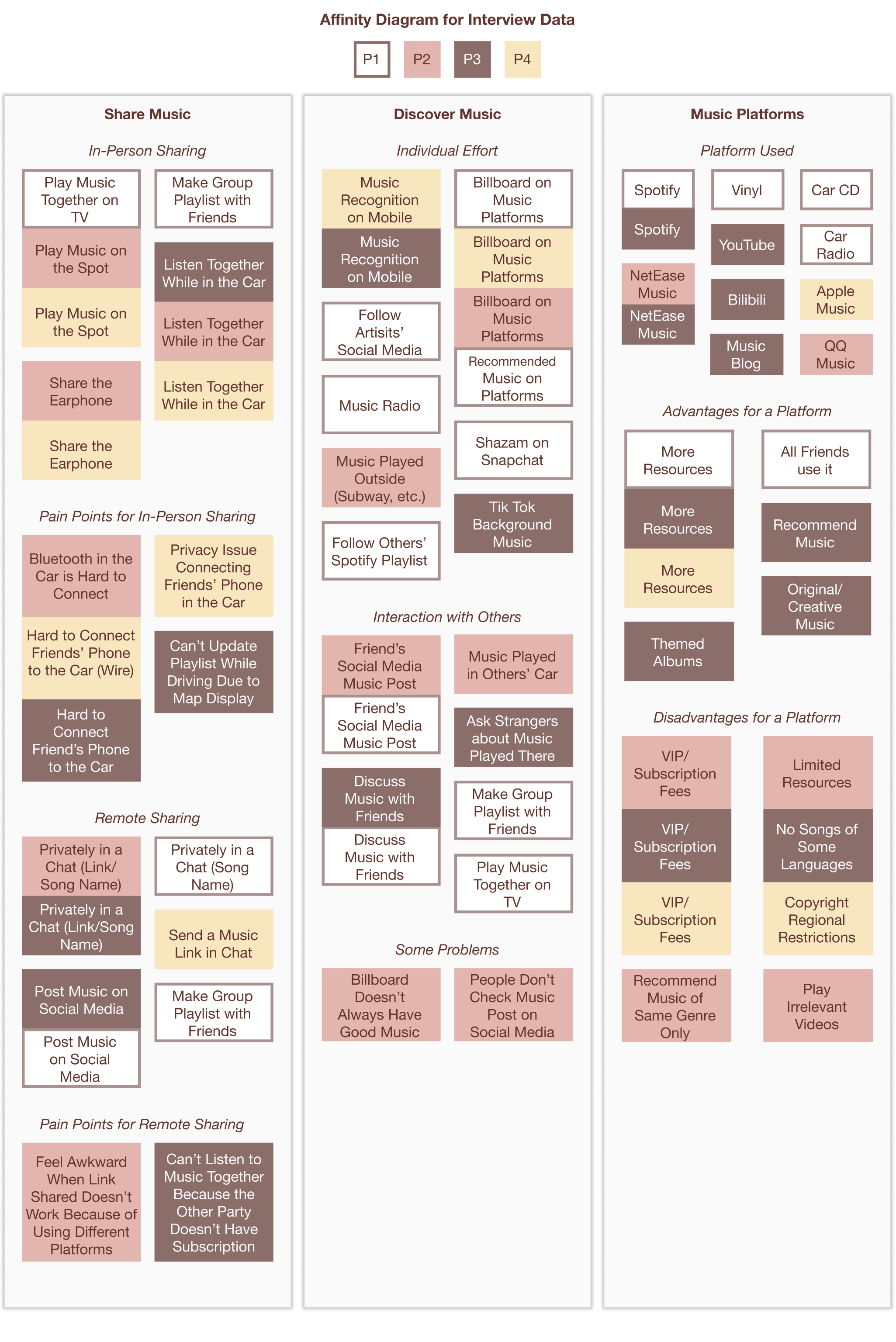
From our qualitative interviews, we analyzed our responses thematically via affinity diagramming to help identify the key themes and patterns. See below.
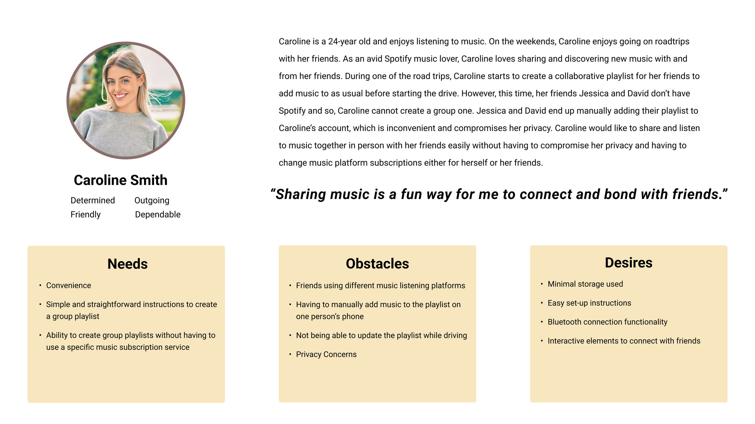
Meet our User
From our primary research results, we created our persona, Caroline Smith.
Ideation of Goals -Scoping
To better align ourselves, we created three overarching goals that we wanted our app, Musica to have based on our user feedback while ideating.
User Flows
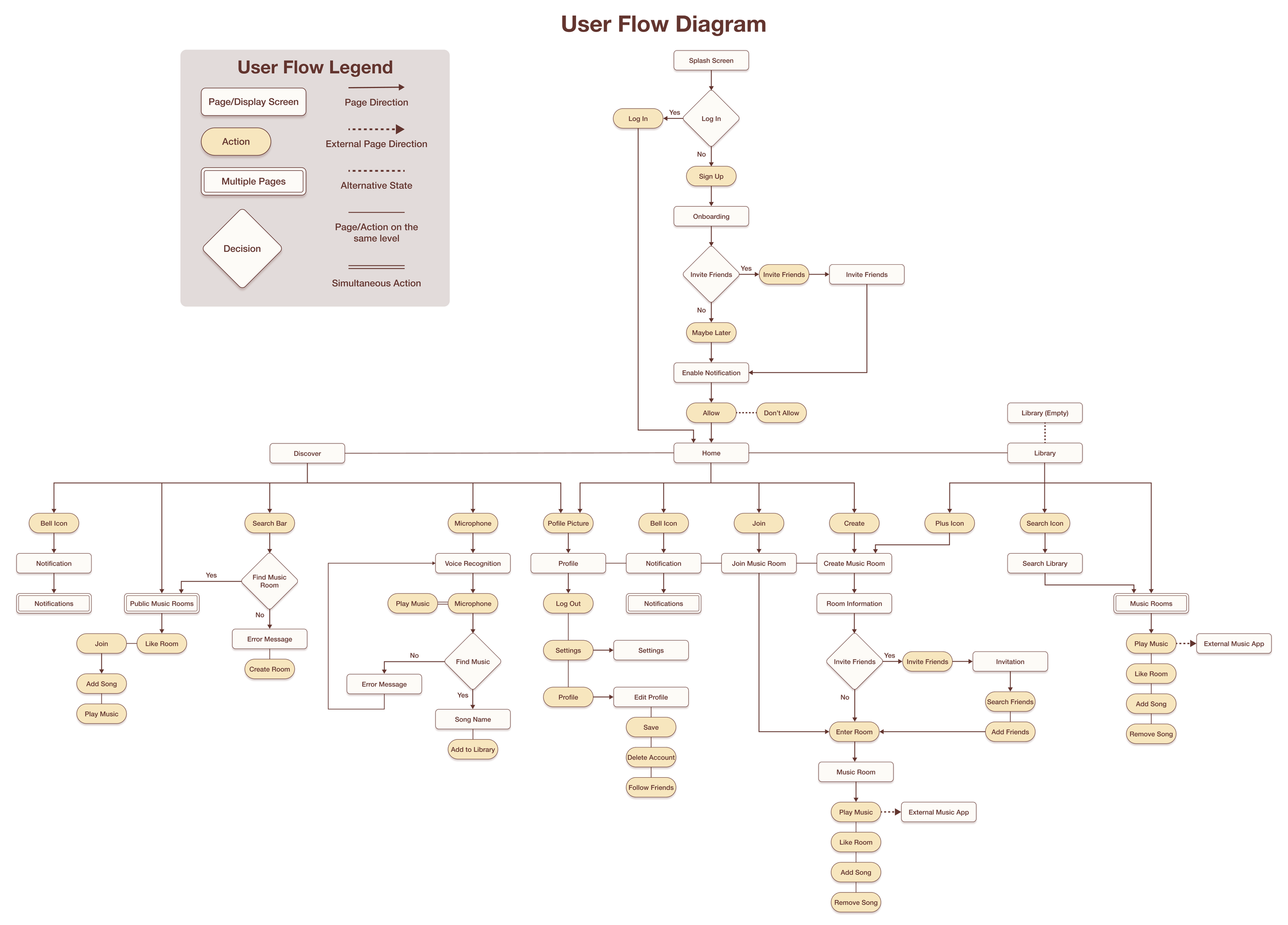
Upon determining what our goals were, we created a user flow diagram to help provide a better idea of how our app would be structured as well as prioritize the key tasks that we’d like to focus on to build our minimum viable product given the one-week timespan. Creating this user flow diagram also allowed me and my partner to discuss in greater detail how each of the key tasks relate to one another as well as relate to our overarching goals. It should be noted that this user flow is focused only on the happy path, that is, the path that a user would go through assuming that no big issues are experienced.
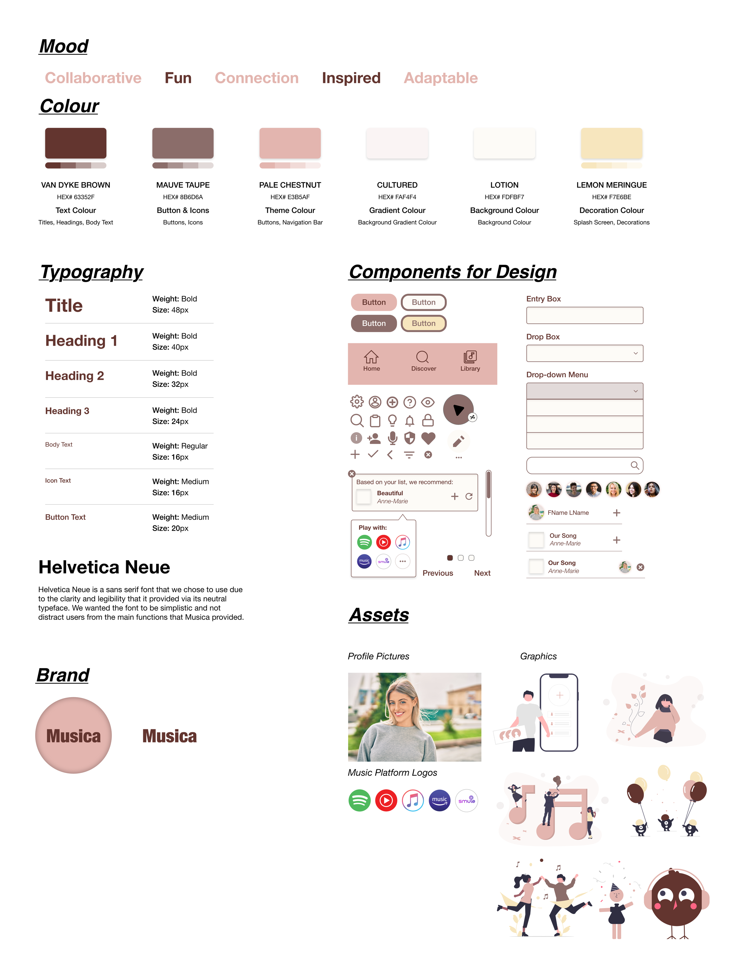
Creating our Design System
To create an app that appeared cohesive, we first created a design system. This would also help me and my partner work asynchronously as we virtually collaborated. We wanted to focus on using warm colour tones such as brown, pink, beige, and yellow to help elicit the mood of collaborative, fun, inspired, and foster a sense of music connection with each other for our app, Musica. We found these warmer colour tones to be more inviting and welcoming, encouraging users to want to join our app.
Reflection: Designing this design system has allowed me to reflect at a deeper level the “why” behind my design decisions - understanding better why I had chose that font and colour, what I was trying to elicit, and whether that was inclusive and accessible or not.
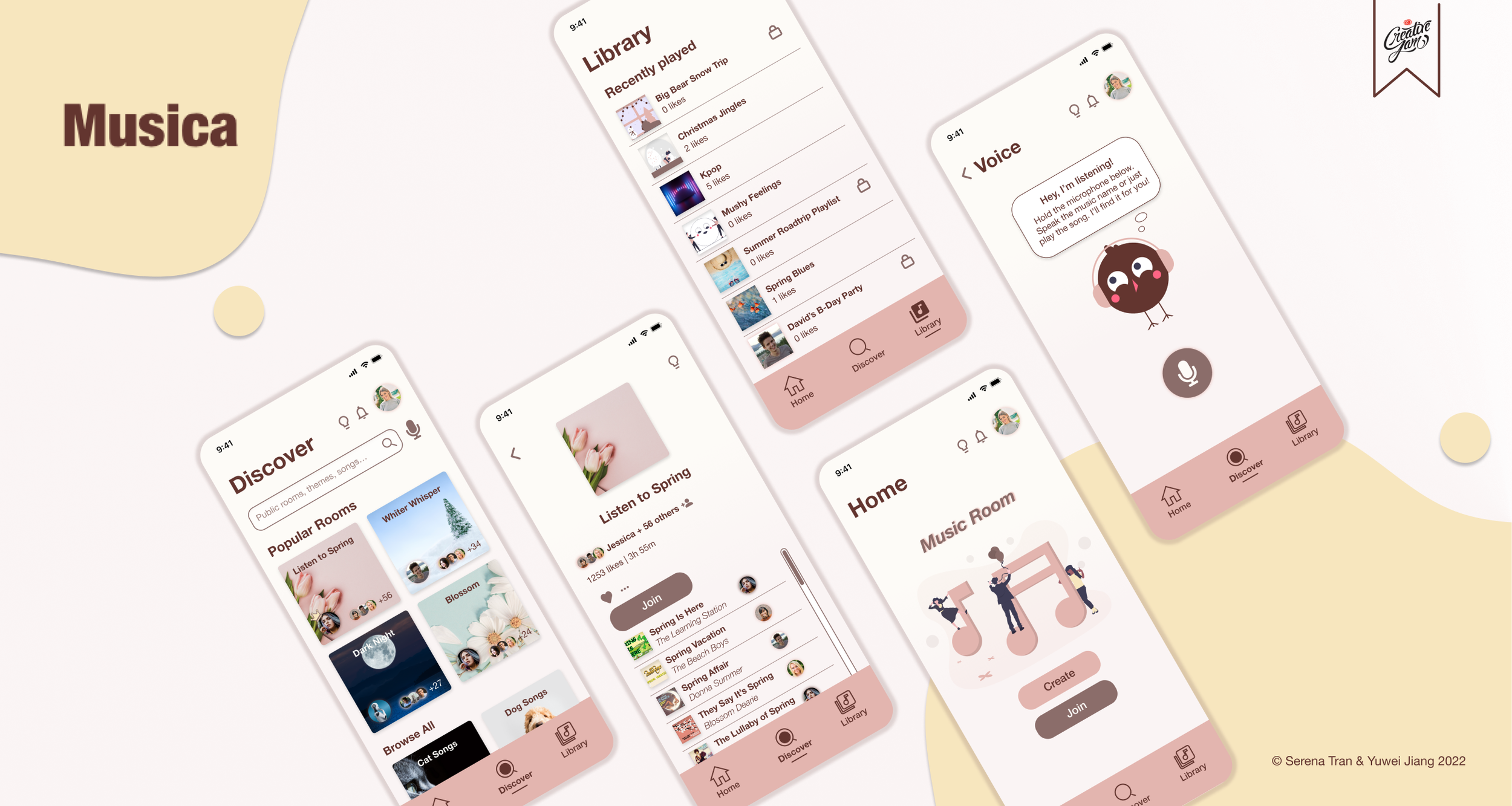
Our Solution
With this, we created Musica, a platform agnostic, music sharing, and discovering tool that brings friends and families together. It allows people to create a playlist together and export it to whatever music platform they have, like Spotify, to enjoy the music. See below key features that we included.
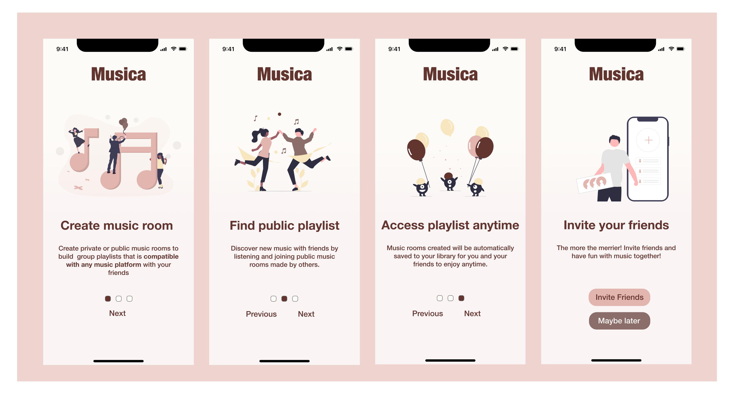
ONBOARDING
Upon signing up, users are first greeted with a quick onboarding tutorial of the three main core features of Musica followed by an opportunity to invite their friends to join in on the fun.
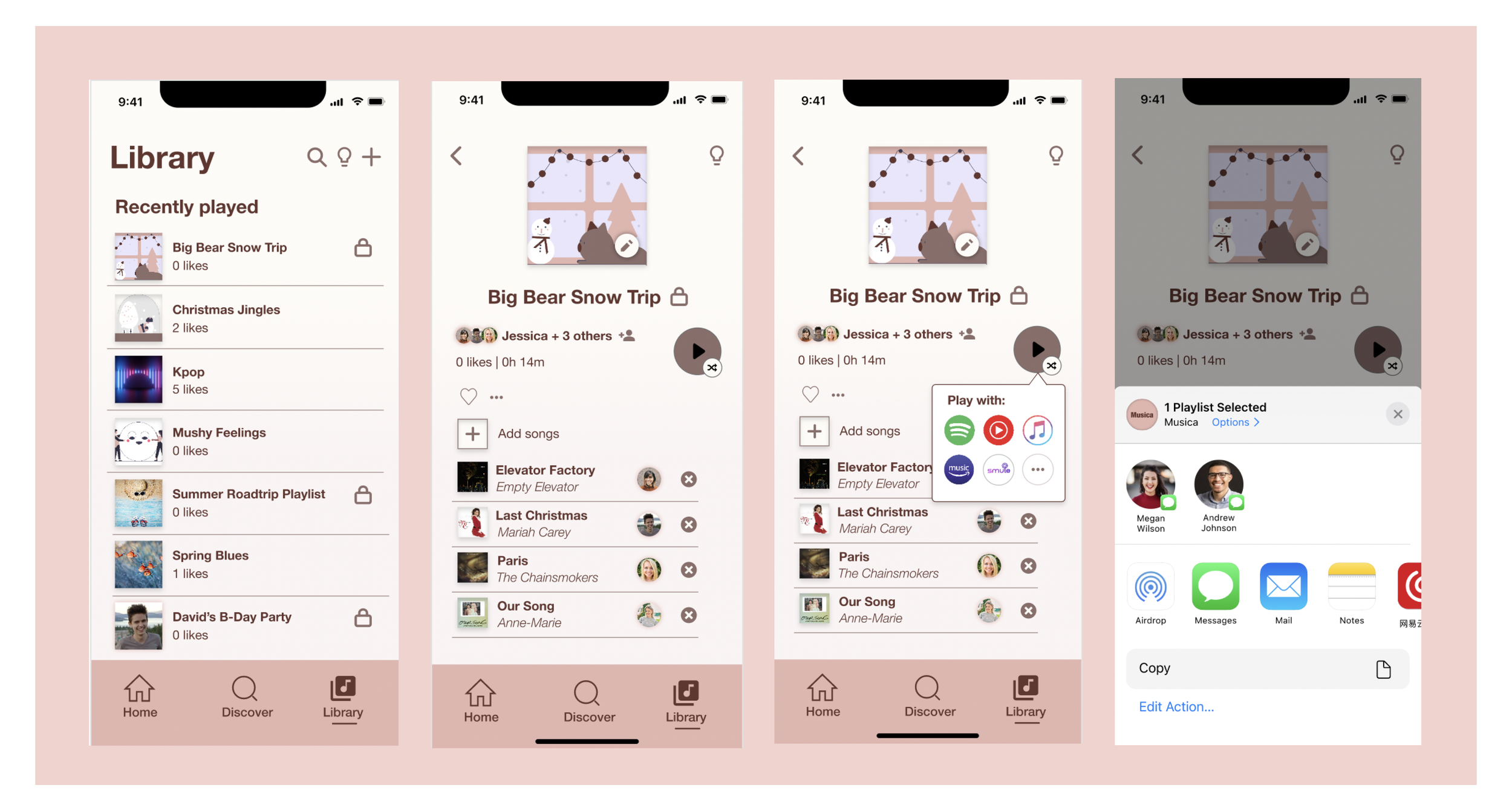
LIBRARY
In the library page, users are able to see all the playlists created and shared with them, as well as those that they have joined.
Those with a lock indicates that the playlist is private and only accessible to those that are shared with
Users are also able to play the playlists created through any music streaming platform like Spotify, YouTube, Apple Music, Amazon Music, etc.
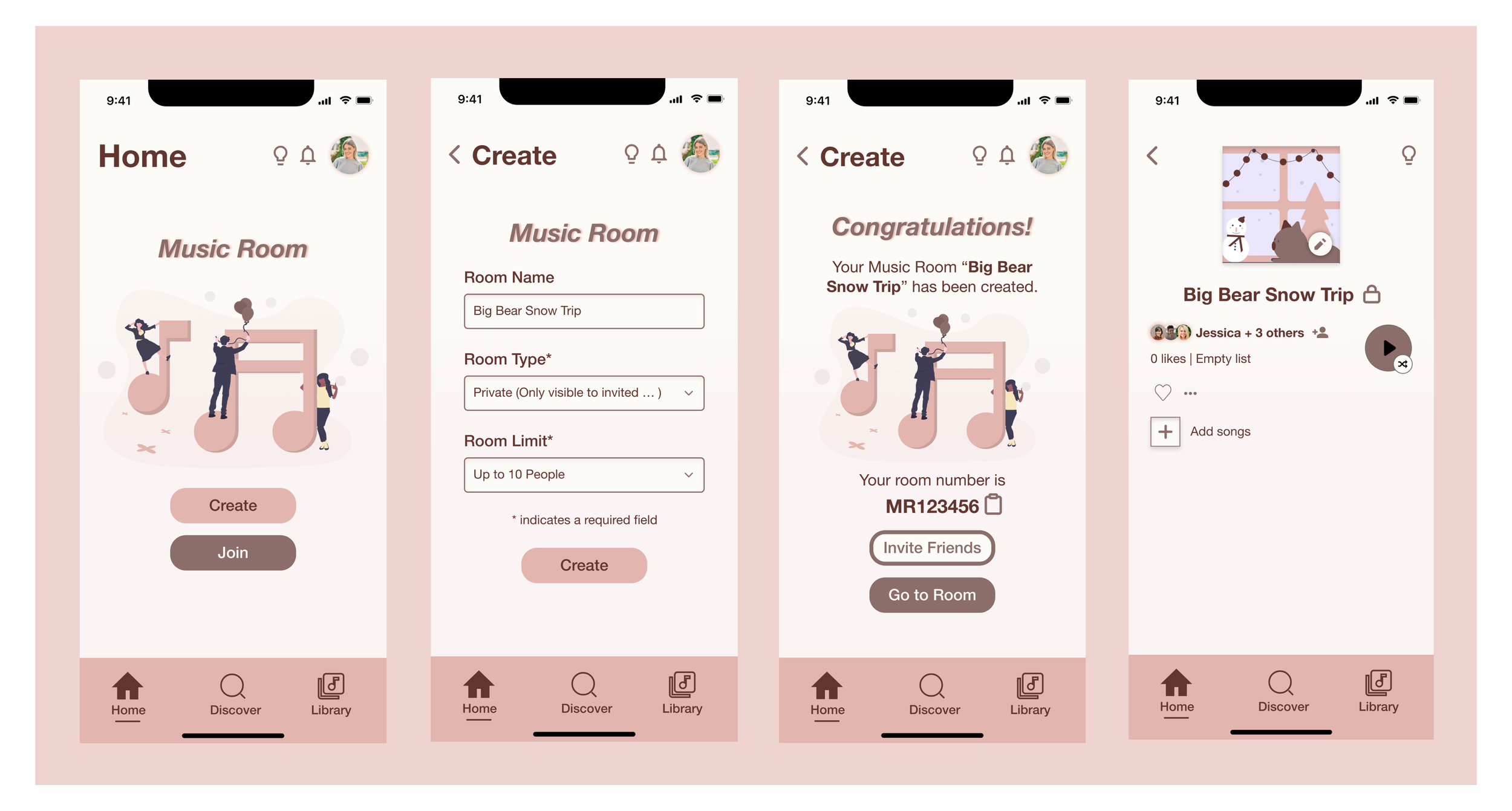
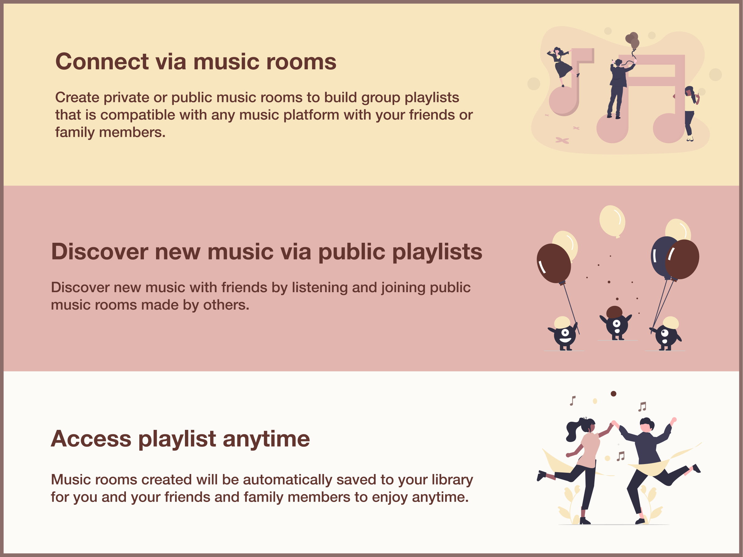
CREATE MUSIC ROOMS
To create or join music rooms, users will go to the home page. When creating a music room, users are prompted to give the room a name, the type of room (private or public), and the room limit (how many people can join the playlist).
Upon creation, they are given a room number code that can be copied and shared with their friends, or they can also directly send invite friends link to their friends to join the music room.
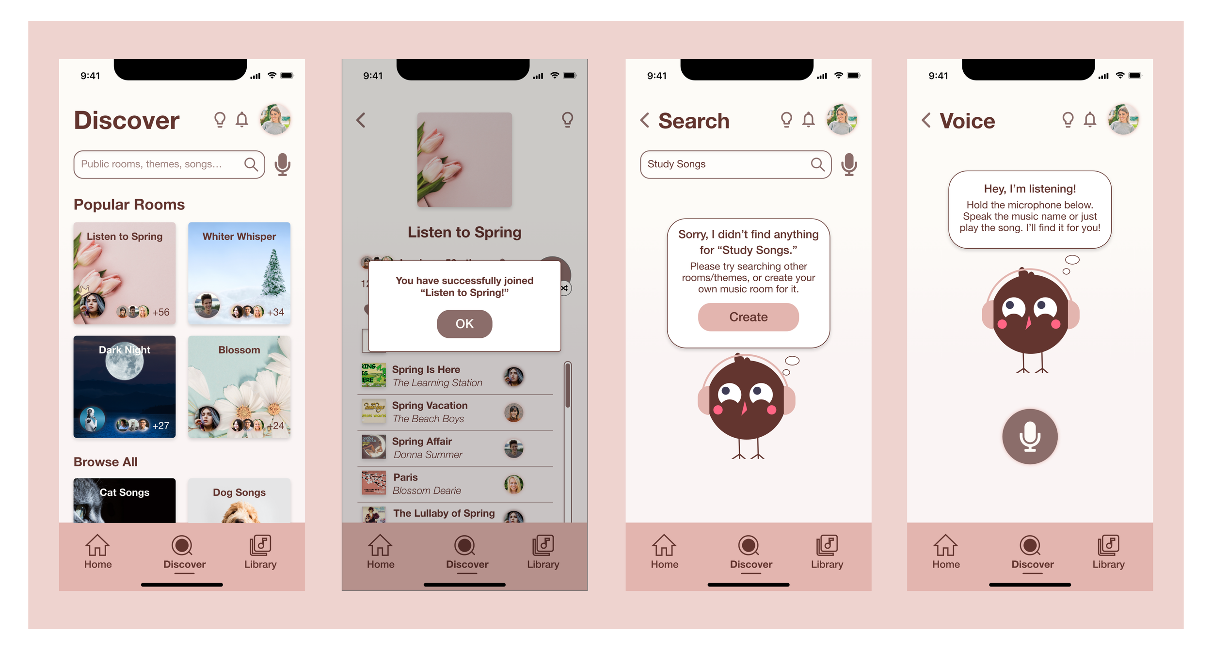
DISCOVER
Users are able to discover public music rooms to join and add songs while also meeting new friends
Users can also search for either a song name or playlist as well as use the voice microphone feature where our mascot, Cana will listen to the song that is playing and identify the song name
Next Steps
Running usability testing sessions with real users and getting feedback and continue to iterate on the designs
Incorporating some aspects of gamification to the app to make it more interesting for users
Building a scanning feature of the profile to quickly find others
Reflections
💡 1. Learning to prioritize
With the short timeframe given, this project has taught me the importance of learning to prioritize what is important and what is not important. Although I would have liked to for instance, design out the settings page further, it was not a priority in this scenario. What was more important was building out the main screens and putting more energy towards ensuring that the task flows made sense with each other.
💡 2. Trusting the process
Design is iterative in nature, with each iteration becoming better than before. I learned to trust that everything will piece together and it is through diverging in the beginning before one can converge and seek for clarity. Learning to be patient throughout the process was something that I learned.
💡 3. It’s okay to start over.
There were a few ideas and sketches that we had initially scratched and we ended up starting over. However, rather than looking at it as a waste of time, those initial ideas were what fuelled the next ideas and what led to the success of our final design creation.
Thanks for reading! :)